I’m a Product Designer based in Bermuda designing SaaS solutions that delight users and help them work smarter, not harder.
Developing a landing page for a wellness newsletter
Project type
UX/UI design and front end development for personal project
Contribution
Project management
High-fidelity mockups HTML/CSS
outcome
Shipped code Presented for final project in coding fellowship
My role
UX/UI designer
Front-end developer
Timeline
Three months (June 2021 - Aug 2021)
BACKGROUND
GLO+GRO was conceptualized during my time in a coding fellowship. It was a wellness newsletter that delivers daily affirmations to subscriber’s inboxes. The mission of this brand is to help subscribers glow from within + grow personally. The newsletter is free to subscribe to + is delivered every morning.
MY ROLE
To design and develop this project within the 8 week timeline for my final presentation and completion of the coding fellowship.
THE CHALLENGE
With so many messages coming at you daily across media platforms and social media, it can be difficult to feel your best day in and out. Additionally, the desire to unplug and recharge is impossible for professionals who rely on using their digital devices regularly for work. These individuals aren’t always able to unplug from their phone to refill their cup + pour into themselves.
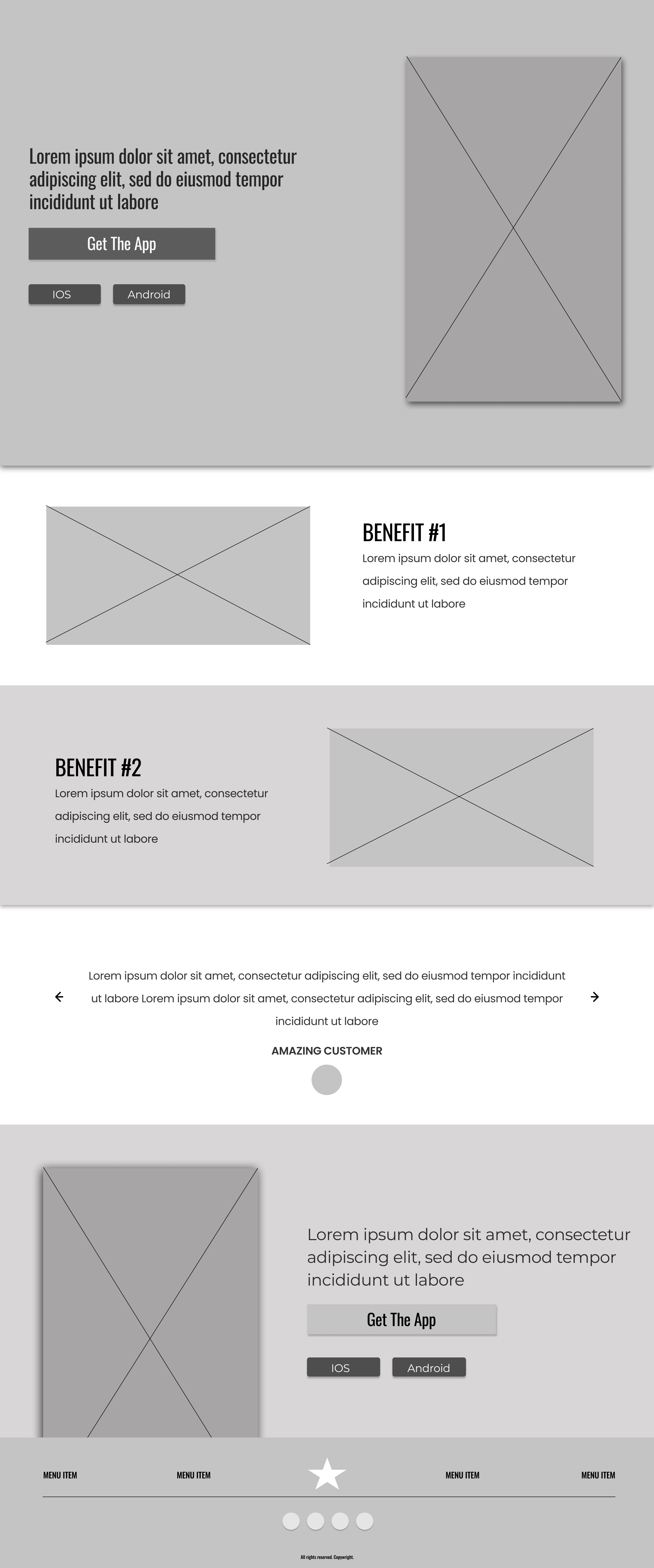
LOW FIDELITY WIREFRAME
The goal behind creating the low fidelity wireframe was to understand the best placement for items on the page. The landing page itself would have one primary CTA and I wanted to ensure that the user was easily able to identify the step they needed to take without having to search.
Insight 1: Originally this project was planned to be a downloadable app, but changed to an email subscription. This decision came after realizing that the user is constantly connected through existing communication platforms. This insight allowed me to shift to an email subscription to easily fit into their daily routine.
Insight 2: By laying out the page’s components, I realized I was giving more information than what the user needed and not prioritizing the primary CTA. This led to me questioning how can I optimize this page so that users quickly get the result they are looking for? The result was condensing the page to solely focus on the subscription.
Final wireframe: The design I finished with took into account the end user’s needs and user feedback.
FINAL LOW FIDELITY WIREFRAME
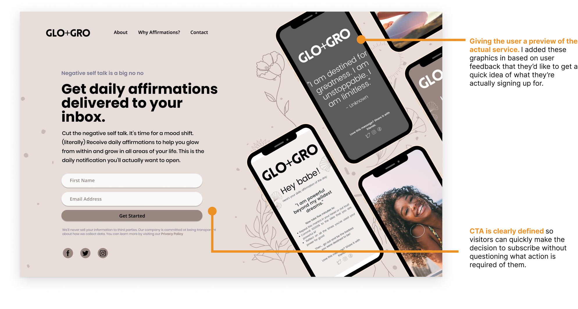
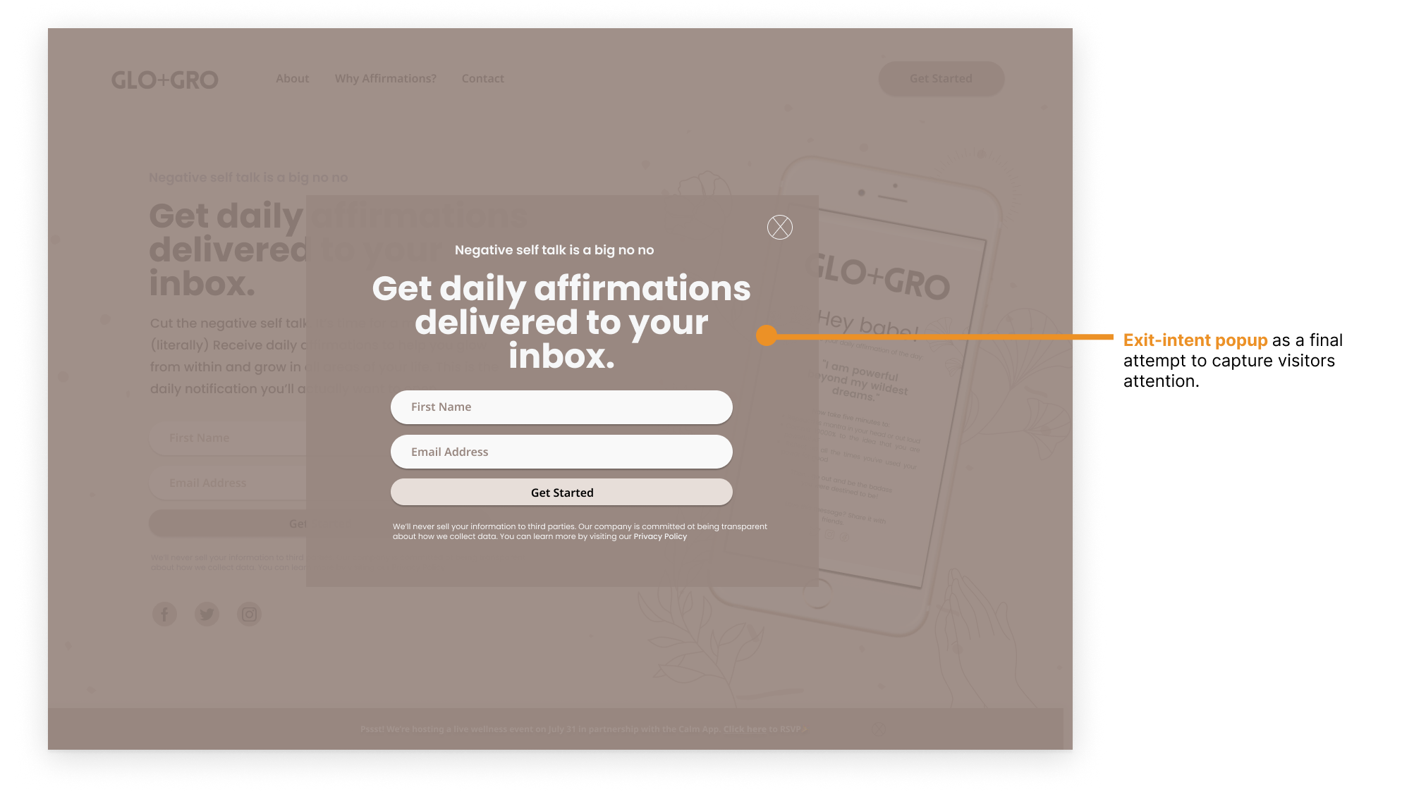
THE FINAL MOCKUPS
The final design highlighted the primary CTA while also taking into account the brand. There were subtle changes made to make the page light, playful and approachable to the user. Elements like rounded corners, the brand color palette and imagery left the design feeling clean, youthful and professional all at once.
DEVELOPMENT
After finalizing the designs, I moved on to focus on implementing all my work through front-end development learned through my coding fellowship. Using HTML, CSS and a bit of Javascript, I was able to deliver a functioning web app.
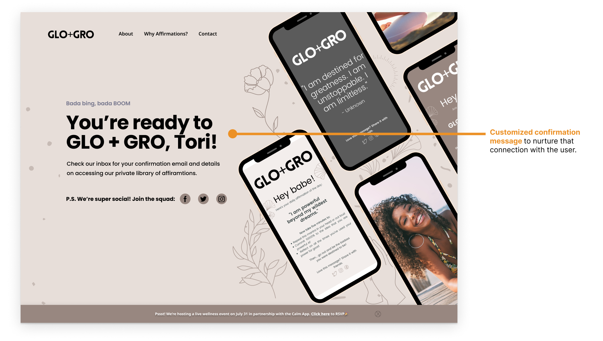
THE FINAL RESULTS
I fully coded a working landing page as my final project during my time as a Coding Fellow at Less Annoying CRM.