Tori Kayla.
Product Designer.
I’m a Product Designer based in Bermuda designing SaaS solutions that delight users and help them work smarter, not harder.
I’m a Product Designer based in Bermuda designing SaaS solutions that delight users and help them work smarter, not harder.
Redesigning Bermuda mini case study series
Design improvements and create mini case studies for local company interfaces. This was a passion project and these companies did not hire me to work for them.
High-fidelity mockups
UX/UI designer
Ongoing

Bermuda is a beautiful destination known for our pink-sand beaches, unforgettable hospitality, and thriving hub for international business.
Our country is at the forefront of solutions in many sectors, however, advancement in the tech space has fallen behind. For this project, I designed new interfaces for local companies and shared mini case studies on LinkedIn to start a conversation about how design is constantly impacting us in our day-to-day.
I worked as a solo designer for this series. My intention was to highlight some of the improvements that can be made to better our digital landscape as a country.
Many local companies create digital storefronts or products that are “good enough”. This mentality is due to Bermuda’s lack of access to other resources, so many people accept products or services that are okay. This creates a domino effect in our society with many people accepting the way things are and not seeking much advancement or improvements.
This challenge presented an opportunity to not only show visual designs that could improve local companies’ user experiences, but also ignite a conversation about the importance of always improving as a community.
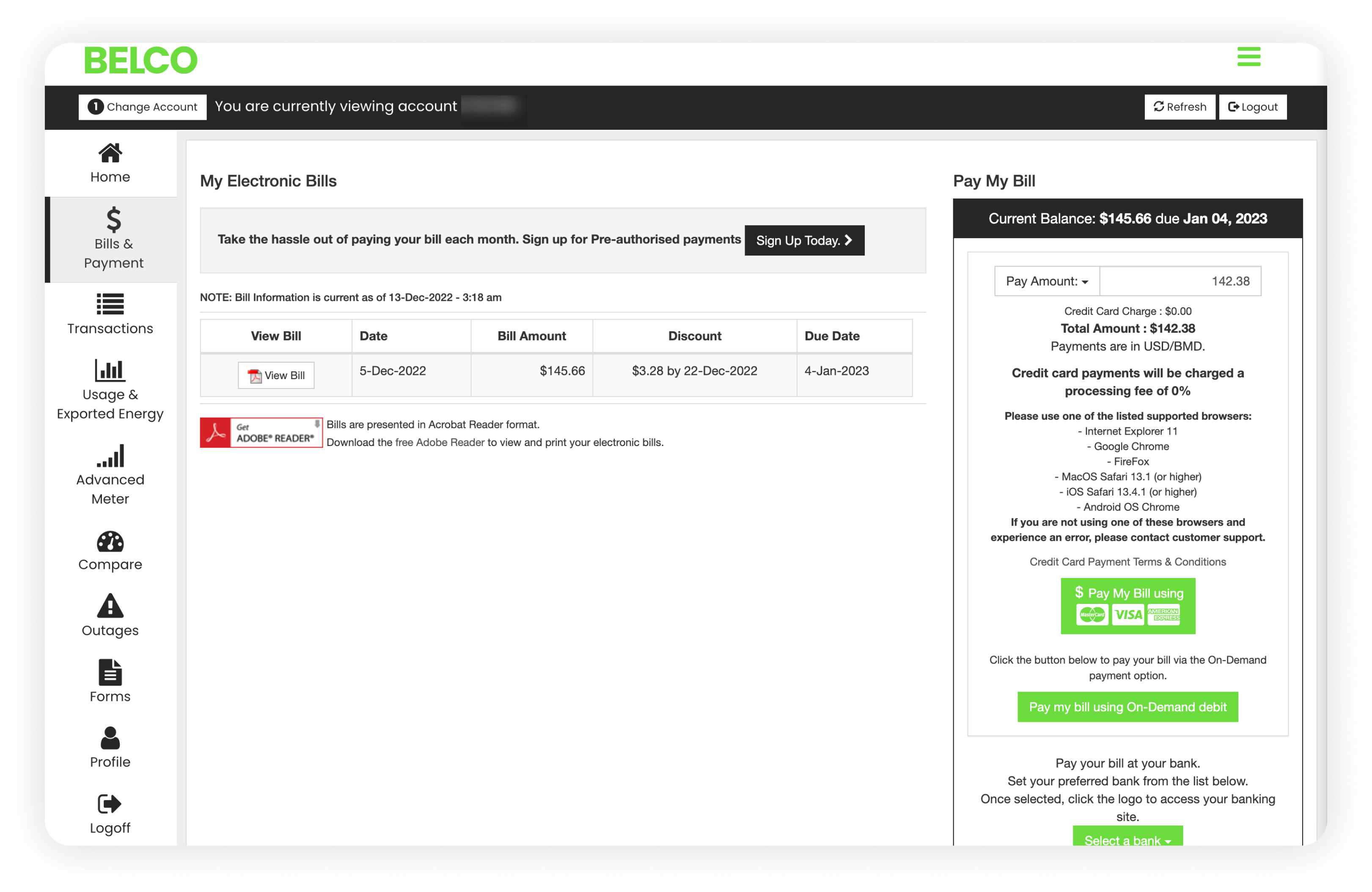
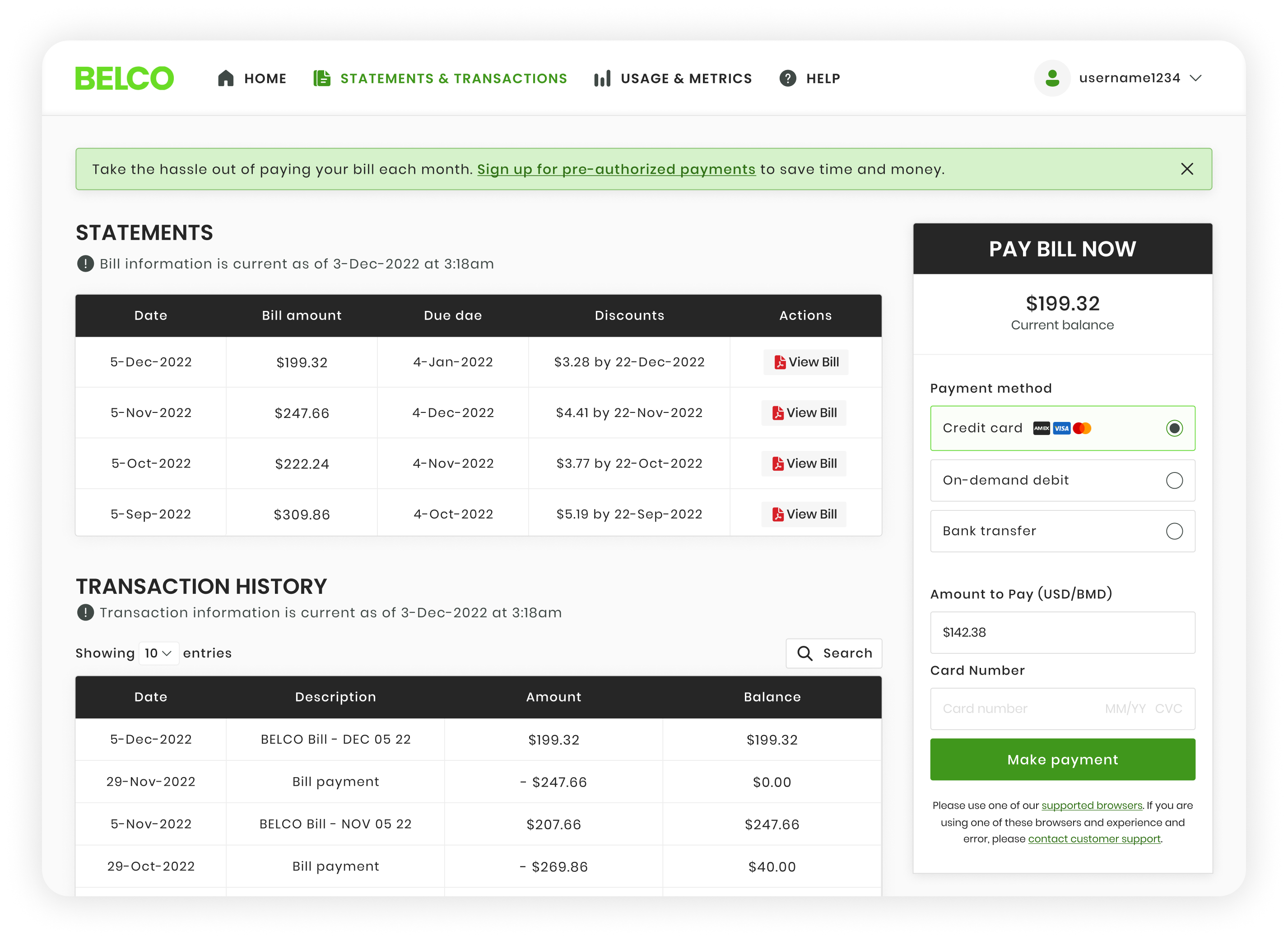
Bermuda Electric Lighting Company Limited (Utilities)
Bermuda Electric Lighting Company Limited (BELCO) is the island’s electricity provider, servicing over 50,000 residents.
For this company, I audited the main portal users log into in order to pay their bill and track their electric usage. Here are some pain points I found in auditing their portal that can be seen in my edits.
+ Large menu, but not necessarily the easiest to navigate. I combined different navigation pages with information that was relevant to each other to create a condensed menu. (i.e. Bills & Payment page combined with Billing Transactions page)
+ Lack of hierarchy throughout the page. I focused on establishing a better sense of hierarchy by adjusting the layout of the page as well as by changing font weights, sizes, and colors. This gives users a better understanding of the primary, secondary, and tertiary information as they move about the page.
+ Site colors are not accessible. With a large portion of Bermuda’s population being an older demographic who potentially have visual impairments, accessibility is extremely important in design decisions. While the original green pops in the logo, using it on buttons as the background with white text isn’t the most accessible. I opted for a darker version of that color to improve accessibility.
+ Overall heavy-feeling design. The original dashboard, while powerful, felt heavy in design. My goal was to refresh the design to feel light and efficient. I also wanted to allow the information to have a better flow throughout the page.
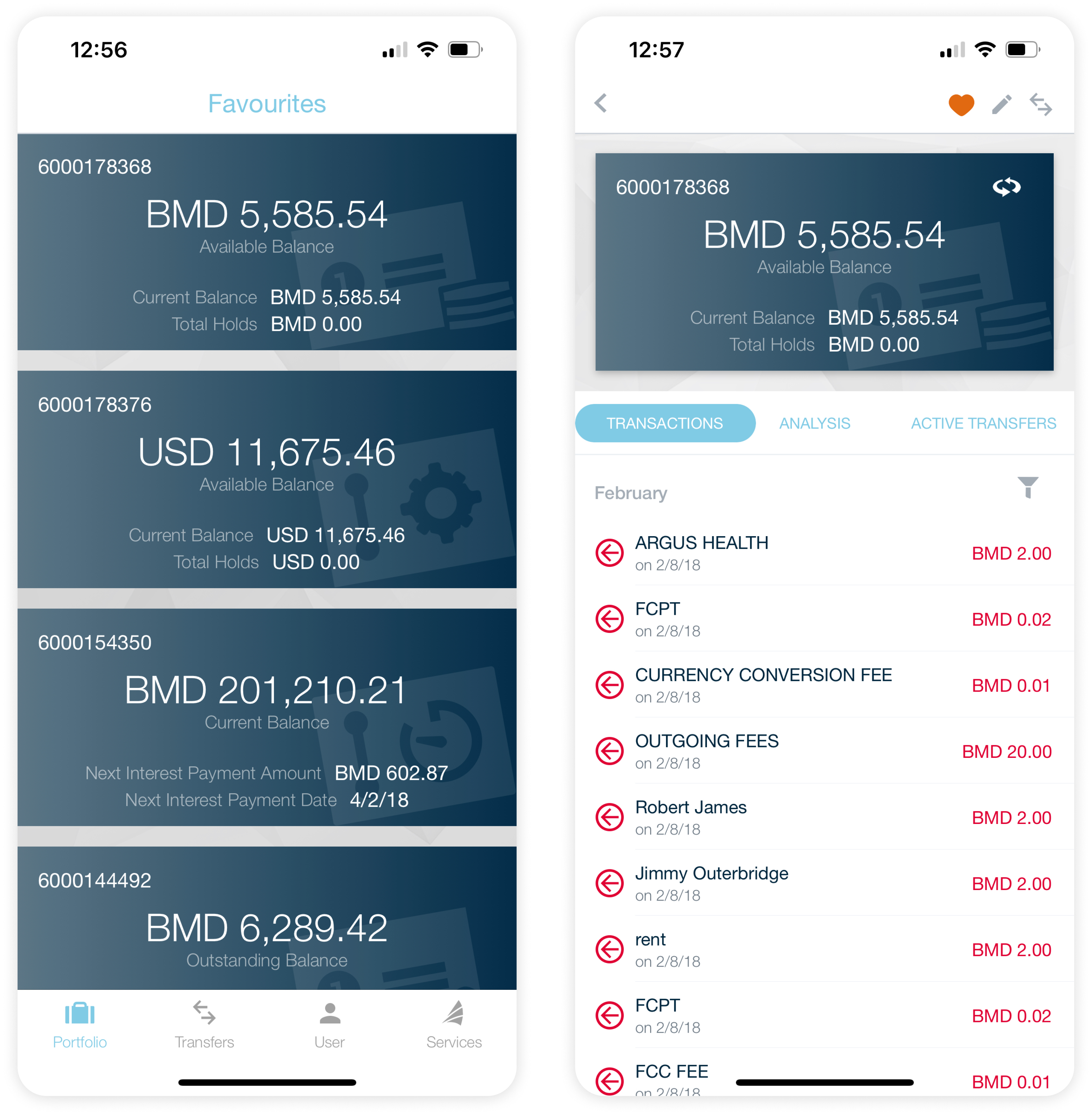
Clarien Bank (Fintech)
Clarien Bank Limited is one of four licensed banks in Bermuda. They provide personal banking, commercial banking, wealth management options, and much more.
For this company, I audited the mobile application, specifically focusing on the accounts page and individual account page. Here are some pain points I found in auditing these pages that can be seen in my edits.
+ Not enough contrast for colors, so not the most accessible. I aimed to increase contrast with the brand’s color palette to create a more accessible experience for users.
+ Not enough hierarchy. Both the portfolio page and individual account page offer a variety of information on your accounts, however, I saw an opportunity to create more visual hierarchy throughout the page.
I enhanced the hierarchy on both pages to further highlight the most important information (“primary”) in each element and slightly de-emphasized supporting information (“secondary” and “tertiary”).
I changed the hierarchy on these pages by adjusting things like font weight, font size, color hue, color saturation, and alignment.
+ Not utilizing iconography to the utmost. While icons were used in the current version of the app, I saw the opportunity to further convey information and actions a user could take by adjusting the iconography.
Originally, the app shows your “favourites” of your accounts first, then the remaining accounts. Instead of labeling the page “favourites”, putting an icon on the favourite accounts shows users which ones they highlighted to be shown at the tops and which are the remaining accounts. It’s a simple change, but communicates the same thing with a bit more clarity to the end user.

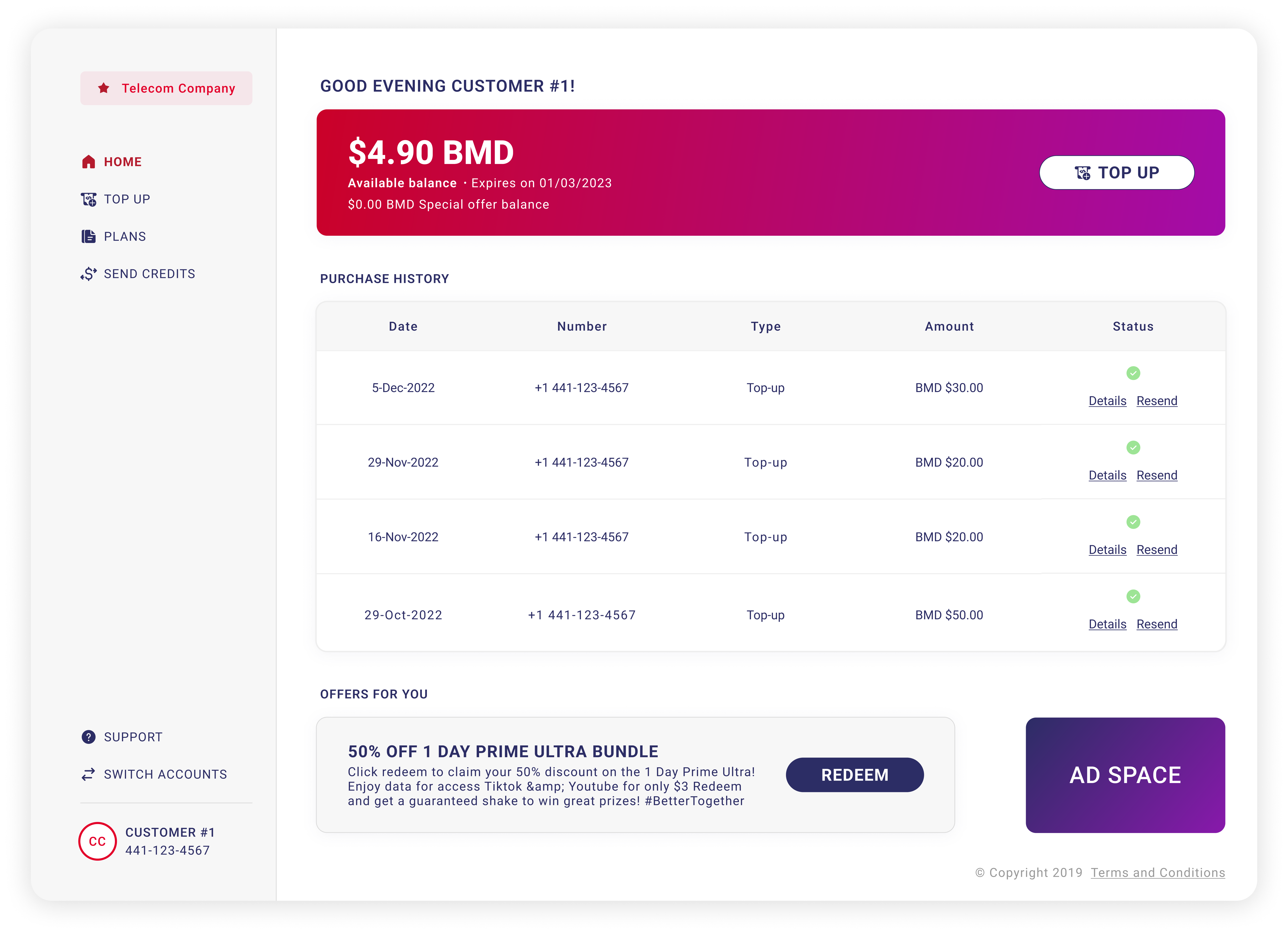
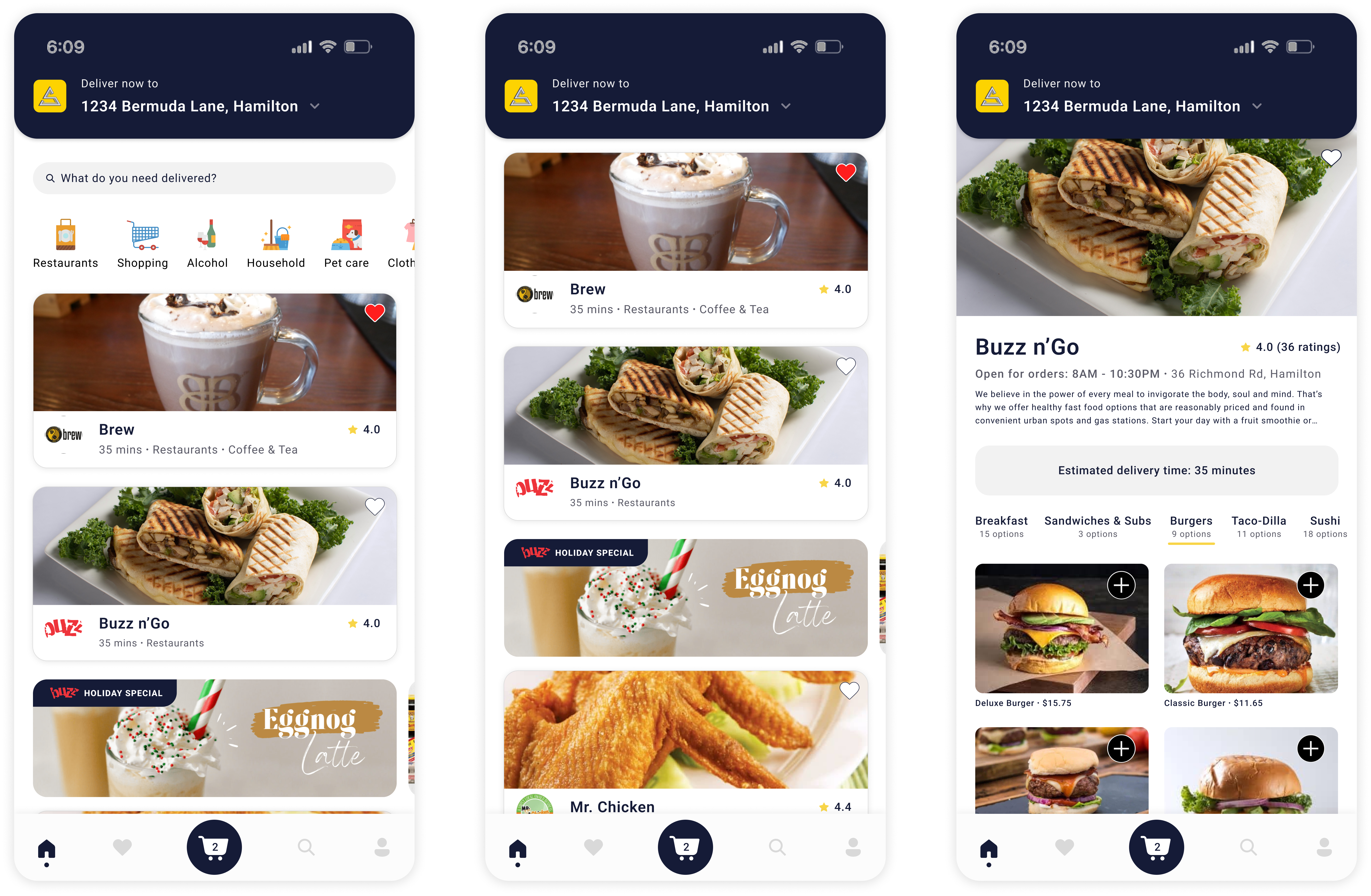
DIGICEL Bermuda (Telecommunications)
Digicel is a telecommunications company providing mobile, TV, + internet services. Customers log into this portal to manage a variety of services for their mobile device including:
+ View + pay bill (postpaid)
+ View balance + top-up (prepaid)
+ View purchase history
+ Send credits
+ View remaining balance on usage
For this company, I audited the web application portal users log into in order to pay their bill. Here are some pain points I found in auditing their portal that can be seen in my edits.
+ Hidden menu hides key actions a user may want to take. Typically, I love a hidden menu behind a hamburger icon, but I felt that bringing the menu out and condensing it to have the key actions a user would take would be beneficial. The redesigned menu feels light, but still powerful for users quickly looking for things like sending credits or even viewing new plans.
+ Lack of hierarchy throughout the page. I wanted to create a better sense of page hierarchy so that users know how to review the information on the page. With a series of containers and adjusting things like background gradient, font size, and weight, I feel the redesigned page has a natural flow as your eye goes from the most important information to the least.
+ Missing widget to help users review purchase history. With this “widget-ish” style design, I asked myself how to add more value to the page for users. One thing that came to mind for prepaid users is being able to see past purchase history to get a sense of how much they’ve previously topped up with and to quickly “Resend” money to their account. The purchase history section adds another layer of ease for users looking to quickly perform an action on their account and log out.
+ More emphasis on their marketing efforts. Marketing is important to any business, but the current design leads with their advertisements instead of user details. In my redesigned version, I put users’ information and actions first before highlighting offers at the bottom of the page. This feels more appropriate and like the page is putting the user’s needs first.

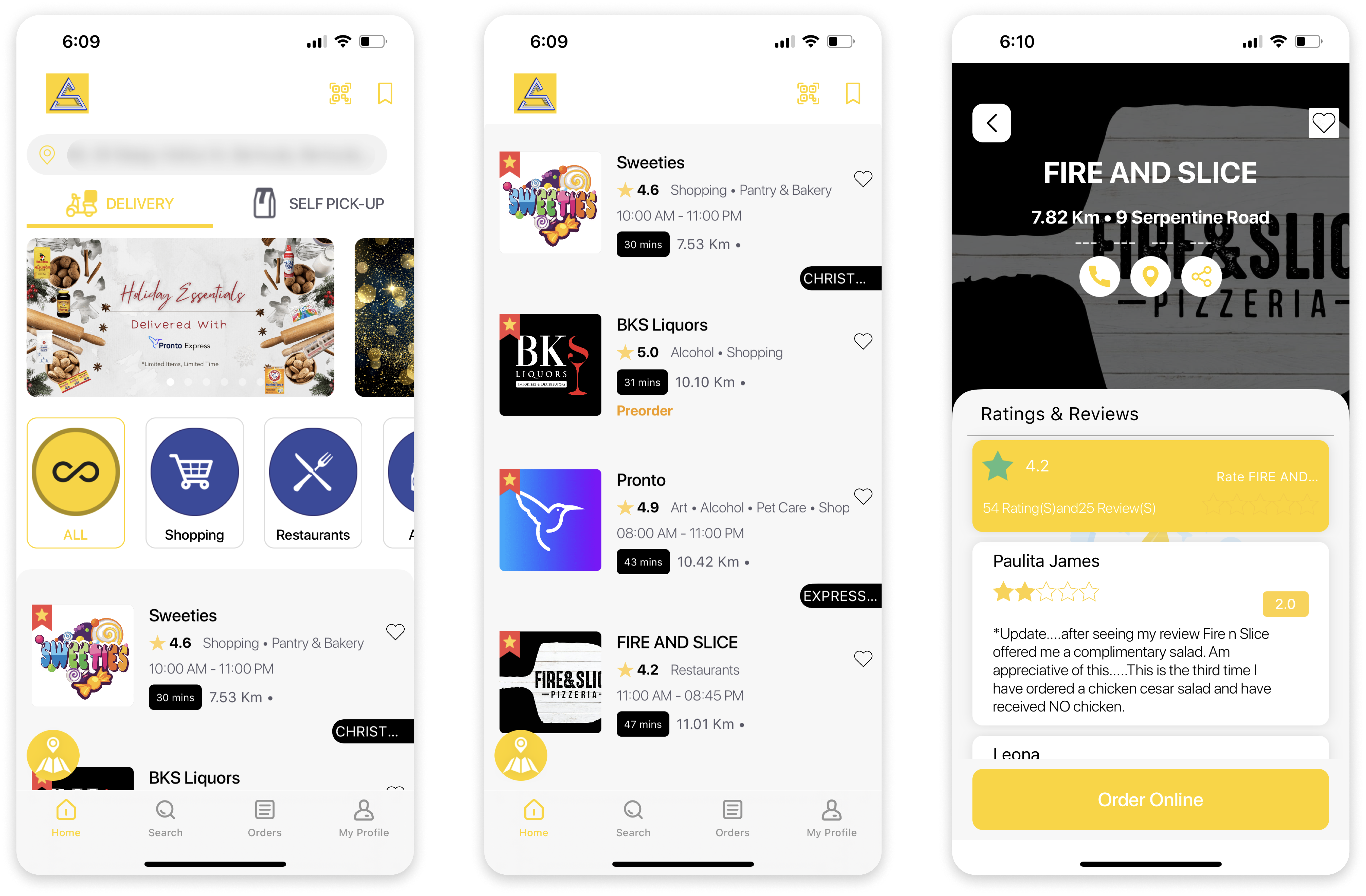
Sargasso Sea Bermuda (Delivery app)
Sargasso is an online marketplace where users can order food, supplies and just about anything here on island. Sargasso agents then pick up and deliver your order to the comfort of your home.
For this company, I audited the mobile application, specifically focusing on the home page and merchant storefront. Here are some pain points I found in auditing these pages that can be seen in my edits.
+ Disjointed navigation. The current application has a subtle top navigation with favorites and a QR code scanner with the remaining navigation links at the bottom. I consolidated the menu to only be the footer navigation for a sleeker look and more efficiency.
+ Not utilizing space to and hierarchy in the best way. Currently the app highlights the delivery then goes into featured ads, then categories. I switched this flow to help the user identify what they need quicker by highlighting the delivery address, search and then categories.
This area also took up a considerable amount of screen space. By redesigning it, this area now takes up less than 1/3 of screen space in comparison to the original 1/2 screen.
+ Lack of product imagery. The existing app leads with brand logos for the merchants. Since this is a marketplace for food and other items, I thought to lead with product imagery instead, while still having the brand logos on the merchant cards and pages.
+ Leading with reviews instead of actual products in the marketplace. The original design has the merchant page showing reviews immediately. While I like the idea of reviews, I don’t think this is the best flow for the user. Plus it can work against merchants if they have not-so-great reviews immediately showcased on their page.
As a user myself, when I click on a merchant I want to see the product options they provide so in my redesign, I lead with that.
+ Not the best in terms of accessibility. Lastly, the primary yellow for this brand packs a punch and is recognizable across the island. That being said, the app utilizes it as a background color with white text often… which isn’t the most accessible for those with visual disabilities. I opted for hues of their secondary blue color to use in place and treated the yellow as an accent color.
© 2026 Tori Kayla | All rights reserved.